15 Worst Website Headline Examples

You’ve got one chance at grabbing your customer’s attention. If you fail, they will leave.
The headline is the largest text on the top of a webpage. It is more important than the images, design, SEO, and calls to action.
It should tell your customers the benefit they will get out of using your service.
Here are 15 headline examples that are ineffective and scare paying customers away.
- Your Company's Name
- Welcome to My Website
- Three Adjectives
- Vague Headline Without an Explanation
- No Headline
- Serving the Community for X Years
- Practice Area Alone
- Important Update or Message
- Over X Years of Experience
- We've Accomplished XYZ Feat
- Thanks for Coming to My Website
- The Way Too Big Logo
- Contact Us Today
- Free Consultation
- Page Title
1. Your Company's Name
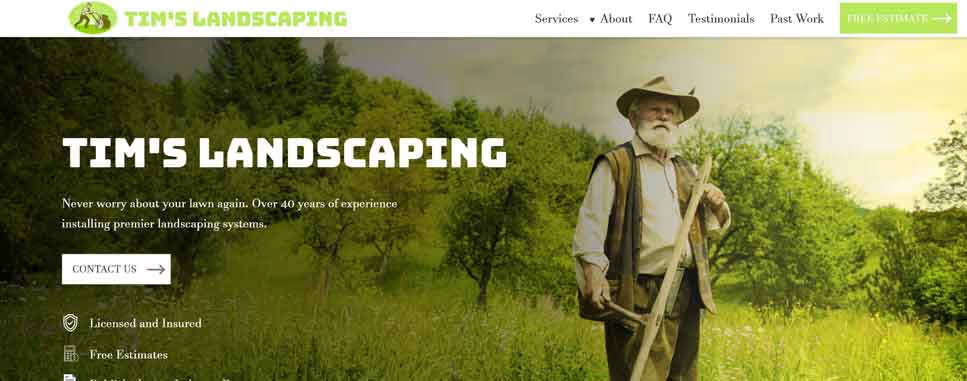
Your company name is important, but not so important that you need to scream it from the rooftops, or rather on the front page in large text.
Placing your company name in the upper left hand corner is enough. It really is.
You can even throw it in your page’s body copy.
But please don’t use it as your headline. That space is way too valuable to waste on something customer’s truly don’t care about.
2. Welcome to My Website
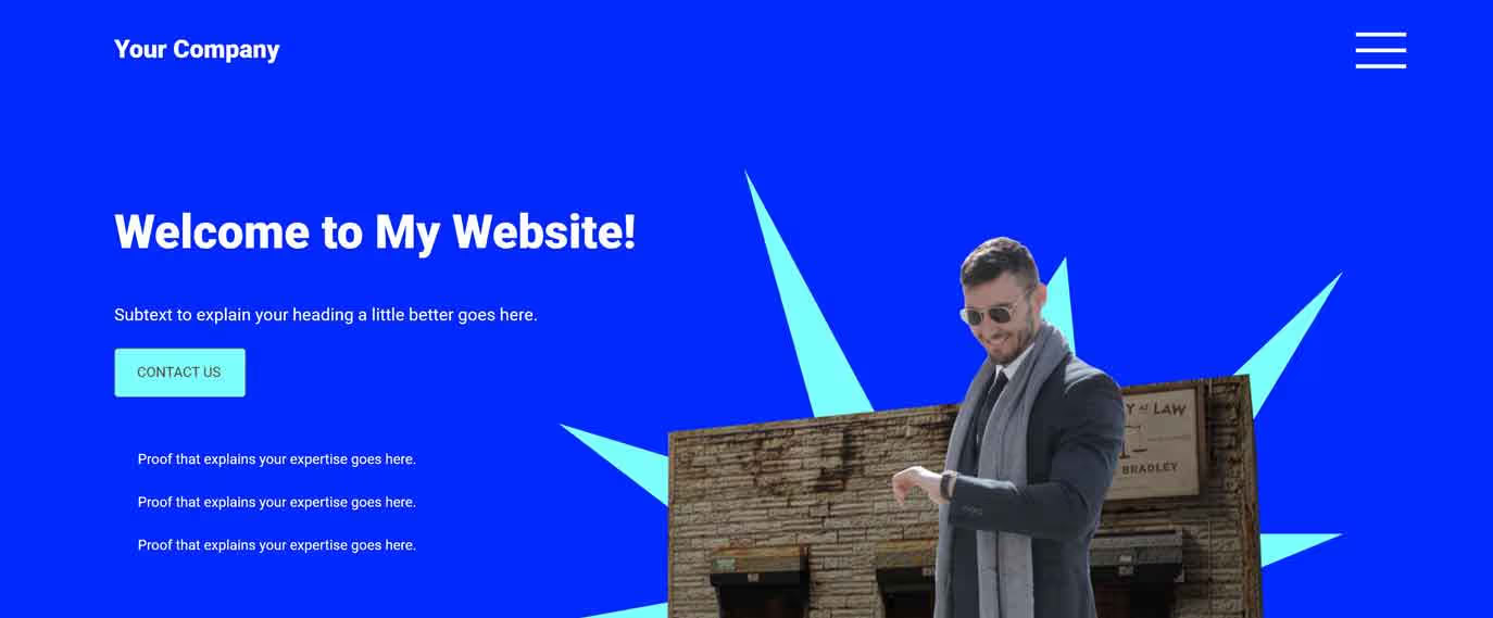
The amount of times I have seen “Welcome to my website” is absolutely mind boggling to me.
There is a difference between walking into your storefront and entering your website.
When customers walk through your storefront, they see a face. A smile. You can shake their hands. They hear your voice.
When someone enters your website, you are a stranger to them. Words are not as personal.
Not to mention the fact that every business in the world could use this headline, and it would tell the user absolutely nothing about your business or what they will get out of using your services.
3. Three Adjectives

Using the three adjectives technique is bad for two reasons: it’s overused and it doesn’t give the customer the benefit of using your service.
Everyone seems to want to brag about how amazing their business is. That’s fine. You can highlight your business’ top three traits lower on the page, but you need to use this important space for the most important information: the benefit!
4. Vague Headline Without an Explanation
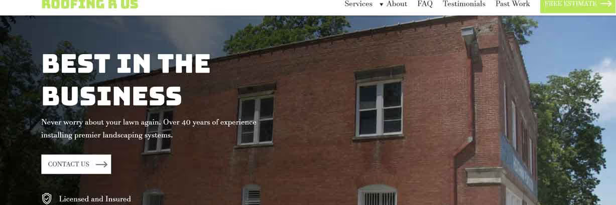
“Best in the Business!” Wow, thanks for nothing.
How is anyone supposed to know what you are talking about if you use vague terms like this?
One of the best ways to get over this hump is to show your website to random people and ask if they understand it completely.
5. No Headline

I’m also surprised at how many websites there are that don’t even use a headline at all. They just throw down an image that covers your whole screen, and then expect you to scroll down to find information.
There are too many competitors out there doing it better that this won’t fly anymore.
Text on your website is so important, so we should give it the priority it deserves.
6. Serving the Community for X Years
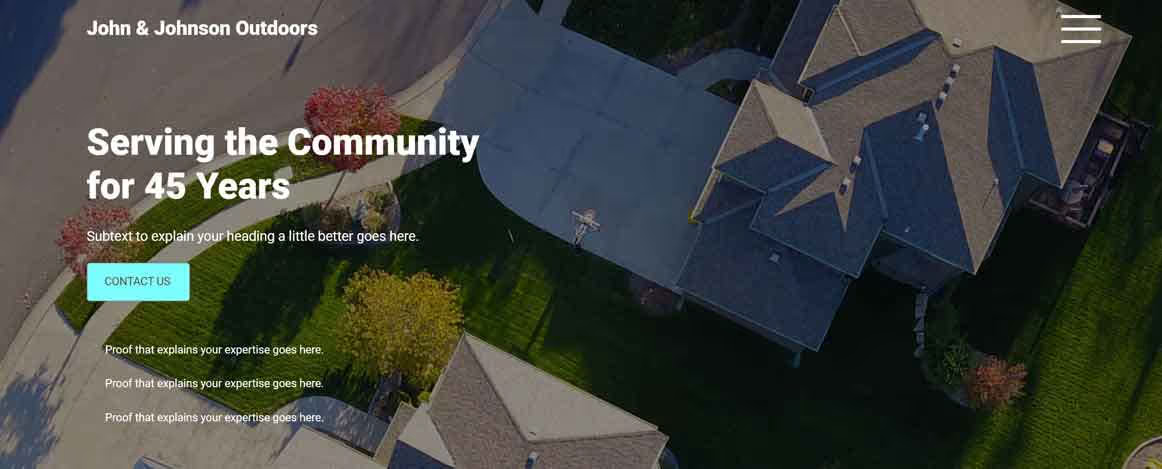
Yes, we know you are a staple in the community and that your great-grandfather started this business 100 years ago.
And don’t get me wrong, this information is SUPER important. It really is. It is essential to your brand.
But once again I have to say, people really don’t care all that much about your business. They just don’t. They care about themselves, and if you give too much attention to your business as opposed to the customer, they will exit and find someone else who will give them the attention they crave.
7. Practice Area Alone

This can be a hot topic. If you are targeting keywords for SEO purposes, you absolutely should list those words high up on the page.
I’ve found the best way to balance keywords for users versus search engines is to use a small H1 tag for your SEO keywords, and then use large text for your attention-grabbing headline.
(If you have no clue what I just said, feel free to send me a message, and I’d be happy to help explain it in more detail.)
8. Important Update or Message
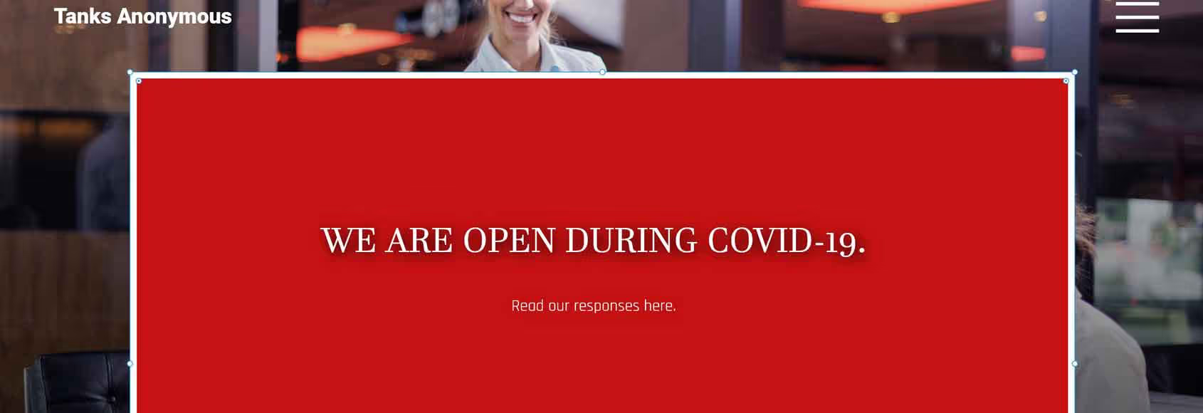
There is nothing wrong with displaying an important message on your website, especially in cases of emergency.
However, when that message is going to be displayed for weeks or months at a time, don’t let it take up too much real estate.
Some customers may want to know how you are responding to a situation, and as long as you have it clearly showing and labeled, they’ll be able to find it just fine without needing to take up half or all of the screen.
9. Over X Years of Experience

This is another example of something that should absolutely be mentioned on your website, but it’s just not important enough to give all of our attention to.
10. We've Accomplished XYZ Feat
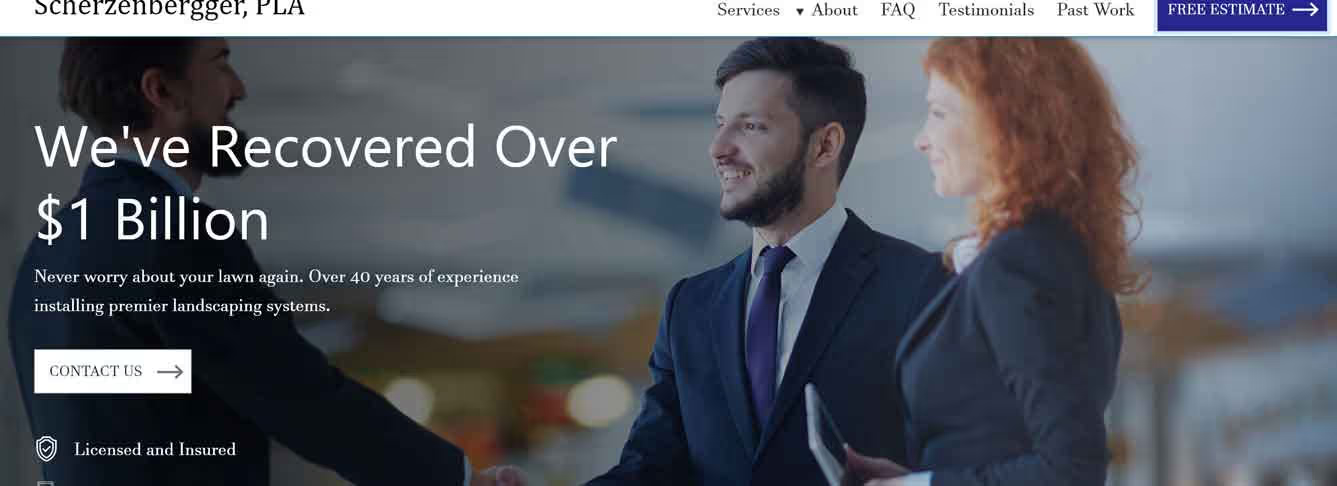
This doesn’t necessarily sound like a bad headline, until you realize that hundreds of other businesses are doing the exact same thing.
Law firms oftentimes like to showcase how much money they’ve recovered for their clients, and that’s okay to show. Just move it down a little bit on the page and make it a little smaller text, that’s all.
11. Thanks for Coming to My Website
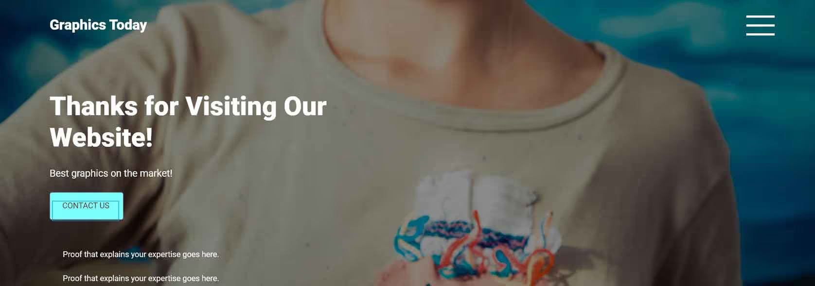
You're welcome. And now I’m leaving your website.
12. The Way Too Big Logo

If you love your logo, that’s great. There’s a perfect place for it on the top of the screen in your navigation bar.
I’ve even seen the logo used twice, once in the navbar and a second time in the middle of the page, covering half of the screen.
13. Contact Us Today

Calls to action are both good and essential on websites.
But before customers “contact you today”, they need to know what they are contacting you for.
Consider placing that call to action underneath the headline, and use the important space for the benefit.
14. Free Consultation

Free consultations are beneficial to customers, but they should be used as additional benefits as opposed to the main benefit.
For example, if a therapist offers a free consultation, the main benefit is not the consultation itself, but the relief you are getting from pain.
15. Page Title

The title of the page is really not that important. The content on the page itself should be the main focus.


