SaaS Webflow Website Struggles to Keep Pace with Company's Growth
Launched
2023
Services
Webflow Dev
Industry
Government, Tech, SaaS


First Step: Clean Up the Webflow Code
Inkit came to me with a two-fold project. First we needed to clean up the CSS code.
They had hired multiple developers in the past, and the code looked like it.
Second Step: Rebuild the Site
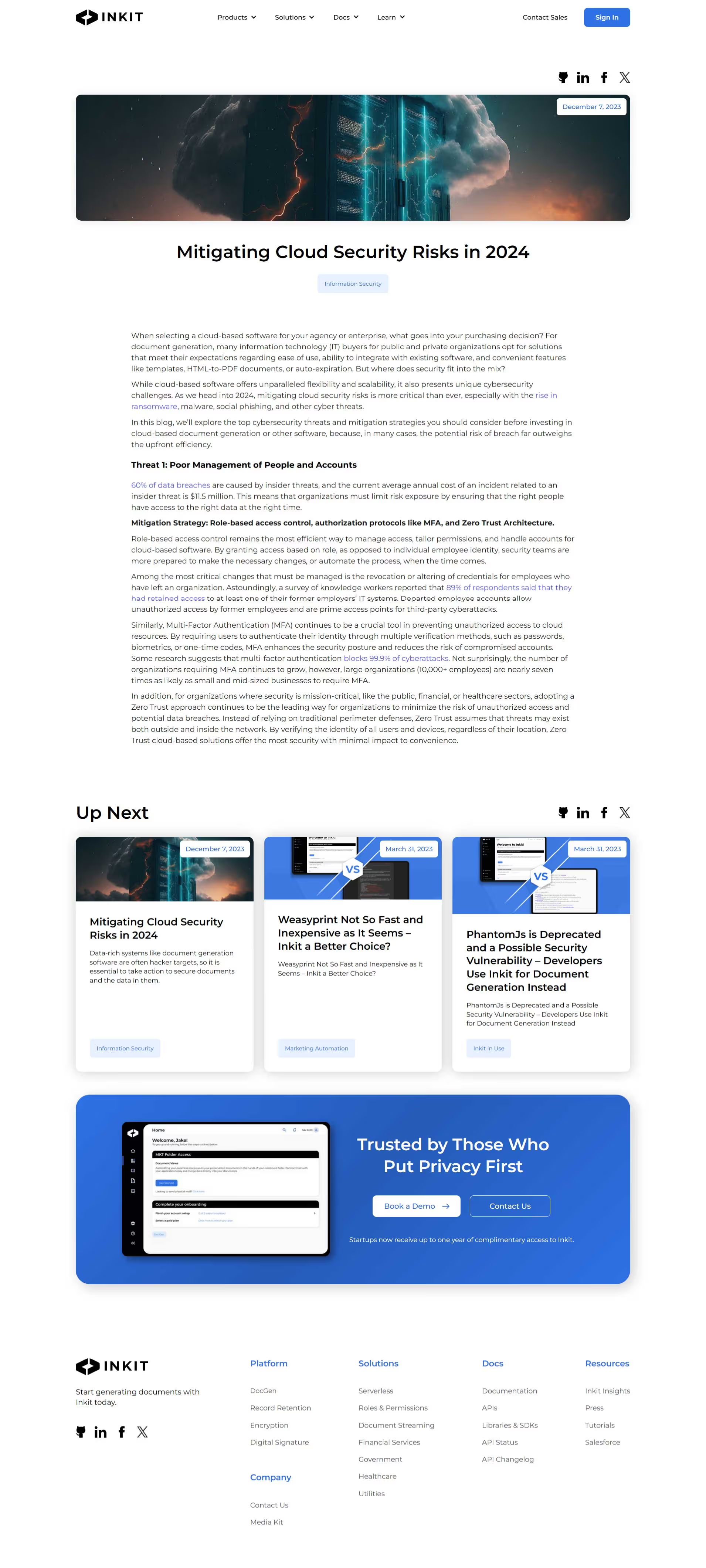
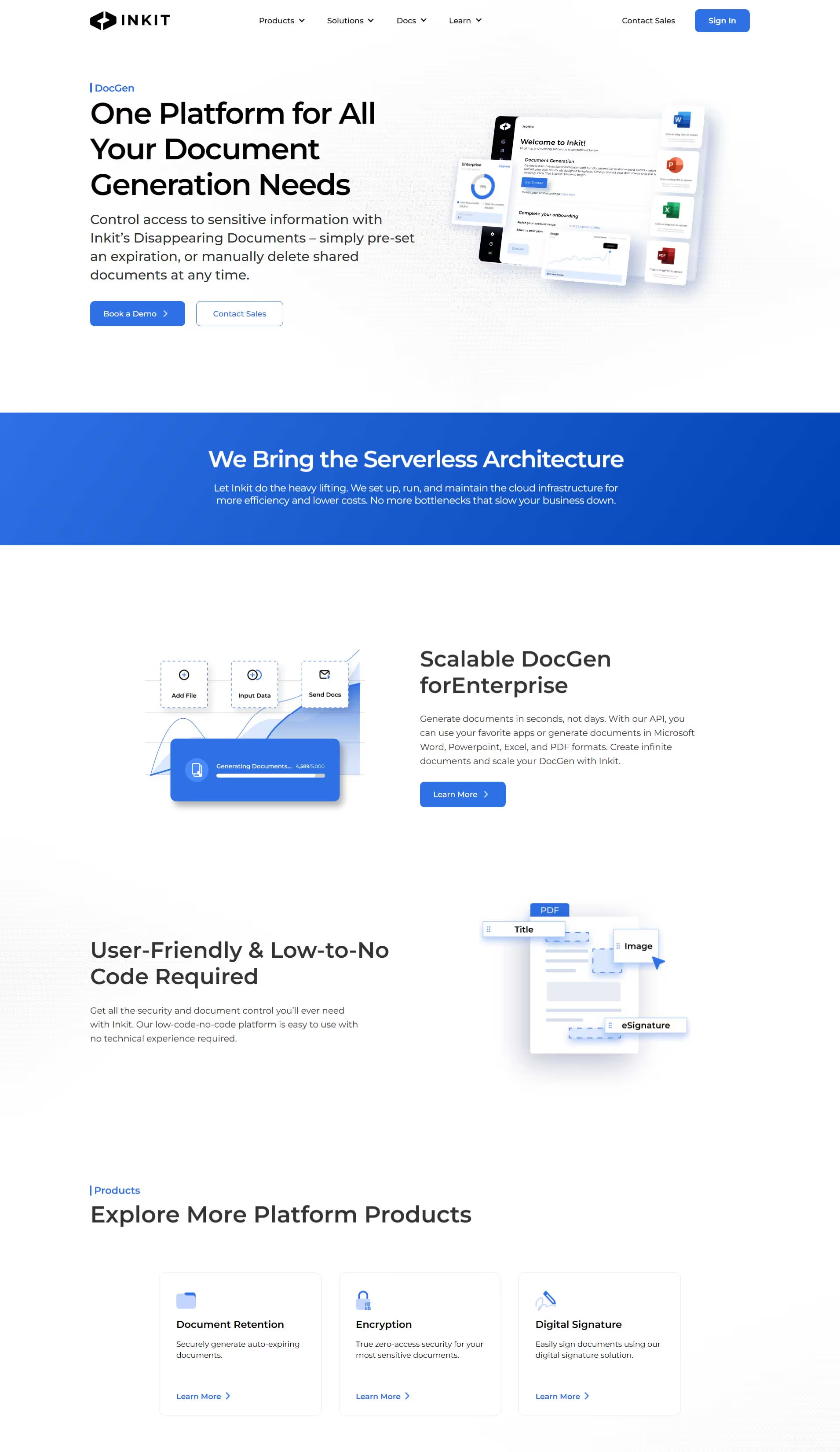
The Inkit team worked async to redesign the site while I cleaned up the old site.
Once that was ready, the Figma designs were sent, and I developed them pixel for pixel in Webflow.
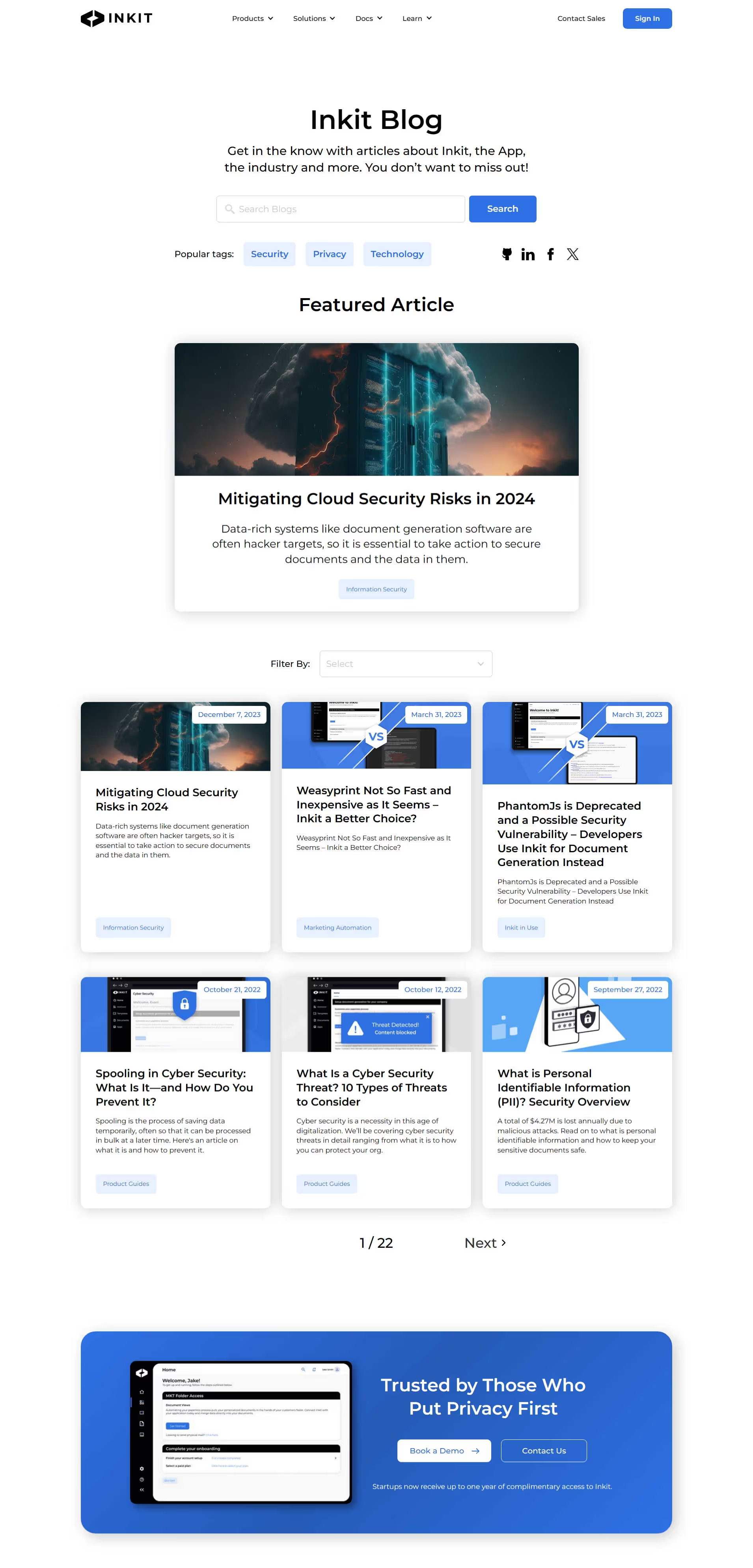
Advanced Filtering for the Blog
The blog posts have several categories that needed to provide filtering options for users.
I also added a clickable "suggested" filter that automatically types the text when clicked.
Built for Growth
Inkit is a SaaS company that is growing, and their website needs to keep up.
The entire site from the CSS styles to the ability to reuse components was built with this in mind.
Advanced Interactions
There are some lesser known animations and interactions in Webflow.
One is the "scroll into view" and "scroll out of view" interaction which can be tricky when you want the animation to reverse motion on the way back up.
This was solved for one of their animations using a trick I had learned from five years of tinkering in the Webflow Designer.


